Make better choices feel inviting
The category often speaks through restriction or technical claims. Mitti needed optimism, trust and appetite at once.
Case study · Brand & packaging
A nutrition brand that makes sustainability feel optimistic, useful and full of appetite.
The idea
Nutrition grounded in the intelligence of the earth.
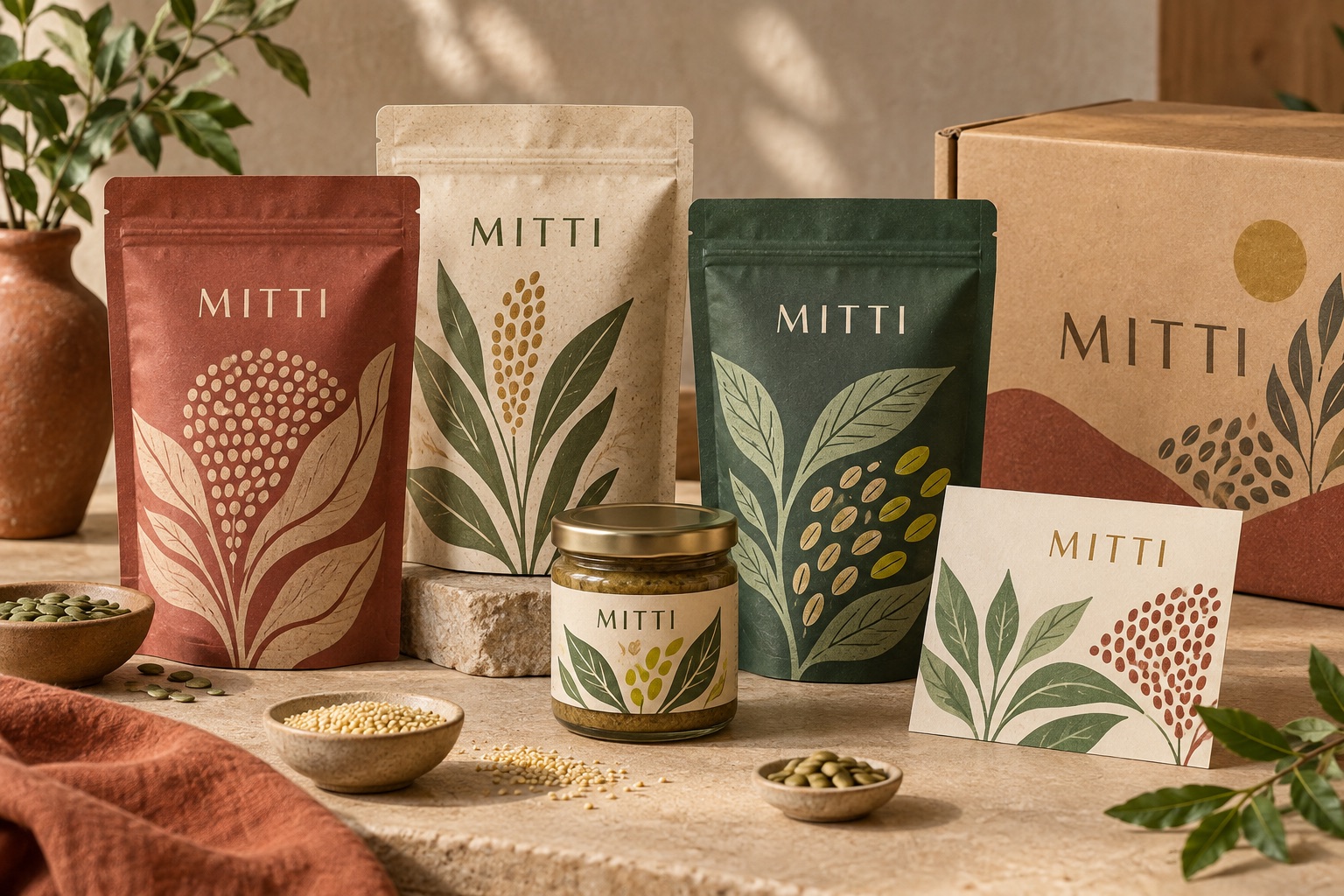
A flexible system of confident type, ingredient-led color and simple claims helps the range feel joyful on shelf and coherent as it grows. The system makes complex benefits easier to scan without losing the pleasure of food.
The category often speaks through restriction or technical claims. Mitti needed optimism, trust and appetite at once.
A bold but natural palette creates navigation across the range while simple typography keeps benefits legible.
Repeatable hierarchy and flexible visual rules allow the portfolio to expand without becoming visually noisy.
A system that starts with the ingredient
Illustration and color do the first work from a distance. Up close, a consistent information structure helps customers compare benefits, formats and ingredients without slowing down the decision.
Large botanical forms and ingredient-led colors create immediate appetite and recognition.
A consistent typographic ladder makes product, variant and benefit effortless to scan.
Simple visual differences help shoppers navigate the range without decoding a new system each time.

What the design enables
Planning a similar project?
We combine positioning, identity and packaging systems for products that need to work hard on shelf and beyond it.